Reference
Date:
[]
This page describes the technical details and caveats of using the Hypertext theme.
This is a quick tour of the more specialized features you should know about Hypertext, beyond the usual stuff that Grav does.
Page Types
Grav lets you create as many page types as you want, but Hypertext really only knows two types: Pages and Collections. Collections have child pages, while pages do not.
That's it. There's no other difference or benefits to using one type over another in Hypertext.
The default page type is the parent for all page types. Single page types like item inherit directly from the default type and if you are using other types like blog_item, Grav will automatically fall back to the correct default page type so you're totally safe. Page collections like the collection and blog types also inherit from default and they bring additional child management and rendering features that are identical to one another. Use whichever naming you like better.
Key features
- Enable JS/CSS - Javascript and CSS can be suppressed across your whole site (from the theme settings) or for individual pages. This applies to plug-ins in particular and both are turned off by default.
- Headless rendering - If you add this query parameter to your URL, Grav will only return the content of the page (including any JS/CSS you enabled/disabled as normal). This is useful for serving content for other applications like embedded browsers within a desktop application.
- Inline CSS - You can elect to have Hyperlink stylesheets embedded directly into your pages, saving a round-trip time. While this leads to more bytes transferred overall, it can still lead to a loading speed boost. Up to you whether you want to prioritize fewer bytes transferred (inline off) or time to render (inline on).
- Image Resizing - Generally recommended against using this feature, but you can have Hypertext try to auto-resize all of your images to more modest dimentions. Good if you're coming in with an existing website, but it's always better to make your images consistently sized from the beginning.
Known Issues & Caveats & Notes
Start content headers at ### if you use styles - The default HTML style looks fine whether you start your posts with an H1 header (# H1 Header) or an H3 header (### H3 Header). But, if you want to use one of the many stylesheets built into Hypertext, you should probably start your articles with H2 headers or lower. Hypertext uses H1 for the title of your website, and H2 for the title of the page currently loaded (except the home page), so any headers you use in your article, blog post, or content page should probably start from H3 to avoid weird style problems.
Make your images consistently sized - This is always true of any web work, but it's really important for default-themed HTML. I recommend:
- Header images for pages should be your website width (768px) by about 100px high.
- Thumbnail images should be 32px by 32px.
Missing frontmatter is bad - If you do not specify any frontmatter in a markdown file, Hypertext will work almost perfectly. However, you won't get filtering by categories. Hypertext will show you all item children within a blog or collection without filtering them by category.
Not all settings are elegant - I can't test every combination of every little thing. In general, most settings look good in any combination, but there are a few that can get really ugly really fast. For example, using tabular rendering of child pages with every column turned on looks terrible on mobile devices. I trust you to pick the ones you really care about and test across devices to see what works for you.
Theme Settings
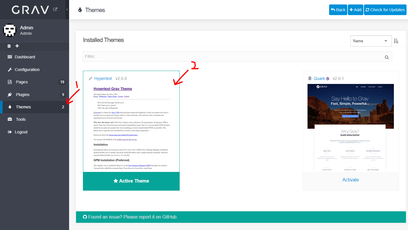
The theme-level settings include options for structural changes, style changes, and the menu bar. A lot of these global settings can be overridden by child settings (like in your individual pages), so keep an eye out for those.
Structural Options
The structure tab contains settings that influence what structural decisions Hypertext makes in drawing your content. Generally this means semantics, but it can also mean the use of decorative elements (like adding brackets around category names, like this: [category_name]).
- Inline Menu Bar - When it's on, you get one line of navigation. When it's off, you get bulleted list navigation.
- Inline Pagination - When it's on, you get one row of page buttons for multi-page content. When it's off, you get bulleted list navigation.
- Use Decorator Text - When it's on, you get braces around categories and vertical pipes between inline navigation items. When it's off, there's no text between items (good for using your own styles).
- HTML Mode - HTML5 will use modern tags like
<article>and<nav>, while HTML3.2 will use vanilla tags with classes like<div class="nav">. - Use Favicon - If you have a favicon, turn this on in order to load it to the client (off by default because it's another lookup). The image MUST be named
favicon.png. Yes, that name and yes a PNG. If enough people complain I'll add an uploader. - Show Last Updated Dates - Blogs and periodicals want dates at the tops of pages, while evergreen content doesn't need it. Here you can turn that stuff on and off for single-page views.
Style Options
The style tab contains settings that influence how your content looks or gets rendered. This is the real core of the theme.
CSS/JS
These fields offer settings for whether to allow CSS or JS files. Some plugins include these kinds of files, so this is a great way to suppress them. Remember that these are global settings, which you can override on a per-page basis. For example, you could install the syntax highlighting plugin, disable CSS/JS here, and then enable it only on pages where you know you are showing code.
- Allow Global CSS - When it's on, pages default to allowing CSS loading from plugins or elsewhere. When it's off, the default is to suppress styles.
- Allow Global JS - When it's on, pages default to allowing JS loading from plugins or elsewhere. When it's off, the default is to suppress scripts.
Themes & Styles
Themes in Hypertext are open-source CSS files available on GitHub and are not my own work. Consider visiting their homepages, contributing, and supporting the authors. Remember that you can test these styles quickly by adding the name or number to a style URL parameter, e.g. YourSite.com/?style=water or YourSite.com/?style=4.
This is a great way to quickly thumb through styles for your website. Use the numbers to find what looks good, then match it to the style in the Theme settings. Try it here on the microsite! Theme 3, Theme 6, Theme 9, Theme 12.
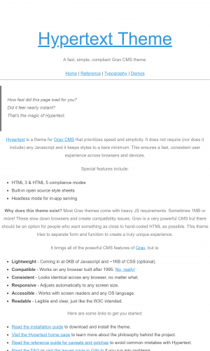
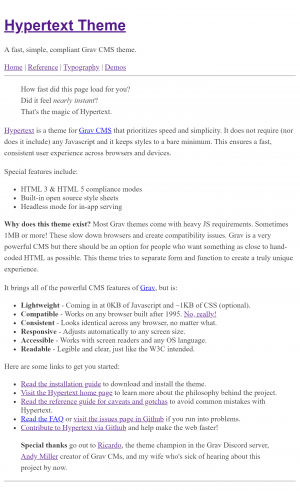
You can check the style examples table in the Appendix to see what each style looks like.
-
Include Method - "Link" is the usual
hrefprocess of adding a CSS file, and forces the browser to load another file. You should do this if bandwidth is the priority (using fewer bytes). "Inline" will add the contents of the stylesheet directly to the HTML, resulting in a faster page load at the expense of sending the stylesheet with every page rather than relying on cached copies. You should do this if speed is the priority. See the home page for a speed analysis between these two options. -
Custom CSS - This is CSS that will be added after everything else on every page load. Good for adding your own touches or fixes to individual style sheets to make sure they always take priority.
Other Configurations
These fields contain other miscellaneous configuration options that override or replace contents of the built-in style sheets (but do not override your own settings in Custom CSS).
- General site layout - Determines whether you want your website centered on the screen or the traditional left-alignment.
- Maximum website width - You can limit how wide your website is, and this is recommended. This website, for instance, is 768px wide.
- Auto-resize header images - This feature will automatically resize the images in your website to approximately good values for a theme like Hypertext. It's far from perfect, and should only be used for very large websites where you really don't want to have to go back and change all your images.
- Hyperlegible text - This feature will replace all paragraph and list text with the Atkinson Hyperlegible typeface from the Braille Institute. Watch Out: this adds over 100kb!
Menu Bar Options
You can add custom menu bar items in this section. Click "Add item" in the lower right corner to get started and from there you can edit details about your links like adding classes or making them open in a new window.
Custom Footer Options
You can add a custom footer to every page on your website from this section.
Page Settings
The page-level settings include overrides to the global settings like whether to show CSS and JS, plus additional content for the page. If your content is actually a directory, you'll find options around ordering and rendering that content.
JS/CSS Overrides
Similar to the global settings, this section lets you override CSS and JS exclusion for rendering this page. For example, if you have the syntax highlighting plugin installed, you might only want to load it on pages where you know you have code, and exclude it elsewhere using this feature.
You can also add custom CSS to just this page in order to add custom style.
Extra Content
Here you can define additional content and metadata for your page, similar to other themes.
- Subtitle - The subtitle is an elongated title addition or explanation of the content that will sometimes appear in Hypertext.
- Show header image - When it's on, the header image will appear at the top of this page.
- Header image file - You can specify which image to use for the header here. If you don't specify one, Hypertext will, by default, look for
header.png. Either way, if you enable header images, Hypertext will look for a header image with the following rules:- Is the specified image in the same directory as the page? If so, use that.
- Is the specified image in the
user/imagesdirectory? If so, use that. - Is there an image in the
user/imagesdirectory with the same name as the slug of this page? If so, use that. - Otherwise, use the first image in this page's directory.
- Thumbnail image file - You can specify which image to use for the page thumbnail here. If you don't specify one, Hypertext will, by default, look for
thumbnail.png. Either way, if a thumbnail is needed by a parent page, Hypertext will look for a thumbnail image with the following rules:- Is the specified thumbnail in the same directory as the page? If so, use that.
- Is the specified thumbnail in the
user/imagesdirectory? If so, use that. - Is there an image in the
user/imagesdirectory with the name of the slug of this page, plus_thumbnailafterwards (e.g.winter-vacation_thumbnail)? If so, use that. - Otherwise, use the first image in this page's directory.
- Summary delimiter - By default, this is
===and you use it to separate the Summary for this page from the rest of the contents. I recommend you leave this as the default. - Summary length - If you don't specify a summary for this page, this value determines how long the automatically generated summary should be. By default, it's 300 characters.
What's the difference between a Summary and a Subtitle? A subtitle is usally an extension to the original title. For example, "Raising a puppy" might be the title of my page, and the subtitle might be "How I learned to raise a dog in 2018". On the other hand, a summary is a short introduction or paragraph for the content the user is about to read or click through to. In this same example, the summary would be a 300 character teaser about how cute the puppy was, how excited I was, and how I would learn a lot while training the puppy to be a good boy.
Child Rendering (Collections only)
The render style determines how children of this page will look when rendered in sequence. I included several different types to help give you a few options depending on the kind of content you have. Blogs render best with summaries while factual content looks sharp as a list or a table. Try a few out and see what works best for you.
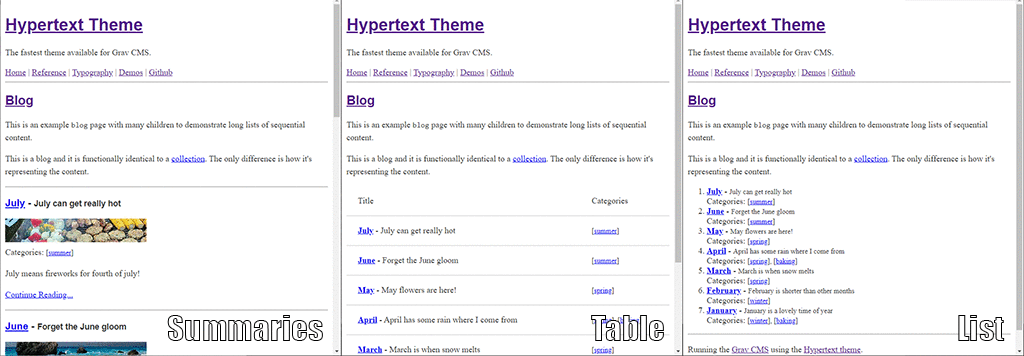
The toggle switches in this section like Show Image and Show Subtitle enable or disable which aspects of a child get rendered. If you turn them all on, things can get cluttered so pick the ones that make sense for your content and go for it.
Not all switches work for all styles. For example, the Table view doesn't allow you to show images, so that switch does nothing for that particular render style.
Children & Ordering (Collections only)
- Items - Setting this will let you customize what children appear for this collection. For example, it's possible to have a collection page that doesn't have any children but instead renders a certain category of pages.
- Max Items - This controls how many items can appear as children of this page. If you aren't using the pagination plugin then this will show the last N entries out of this page's children. If you are using that plugin, then this will show N entries per page.
- Order By - Here you get to pick what criterion is used to order the children.
- Order - Here you get to pick whether to show them ascending or descending.
- Show Prev/Next Links - When it's on, Hypertext will show
NextandPreviouslinks when a user is viewing a child page of this parent page. This is useful if you have highly ordered content like blog entries or multi-page content stored under a collection.
Appendix
| Screenshot | Name |
|---|---|
 |
#0 air |
 |
#1 hypertext++ |
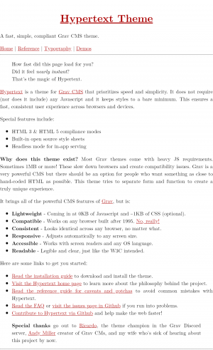 |
#2 latex |
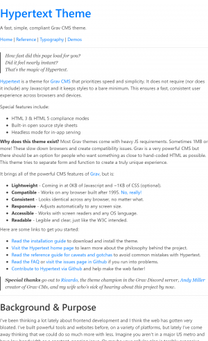 |
#3 marx |
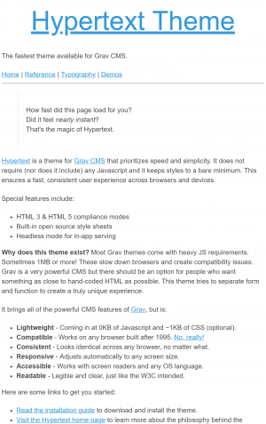 |
#4 modest |
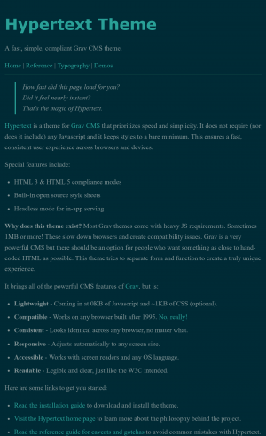 |
#5 sakura |
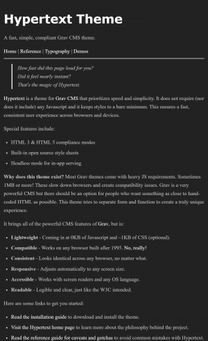 |
#6 sakura-dark |
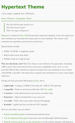 |
#7 sakura-dark-solar |
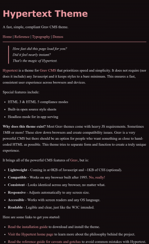 |
#8 sakura-earth |
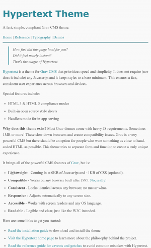 |
#9 sakura-vader |
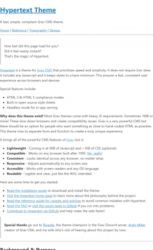 |
#10 stylize |
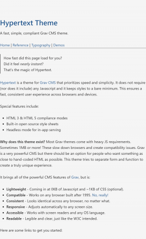 |
#11 tacit |
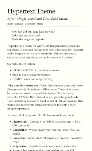 |
#12 tufte |
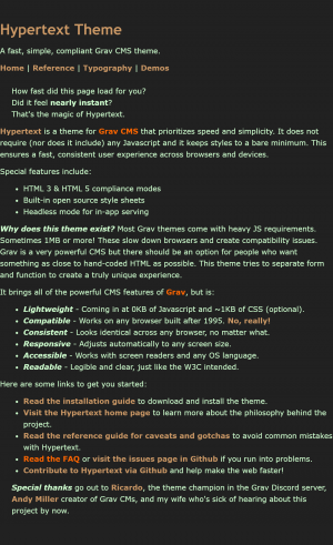 |
#13 w3c-chocolate |
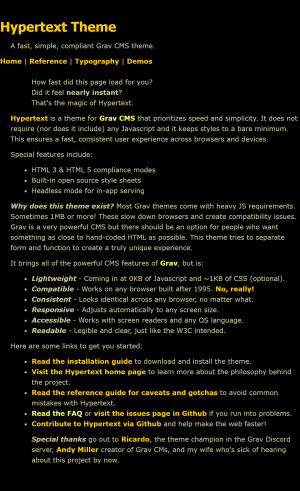 |
#14 w3c-midnight |
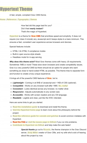 |
#15 w3c-modernist |
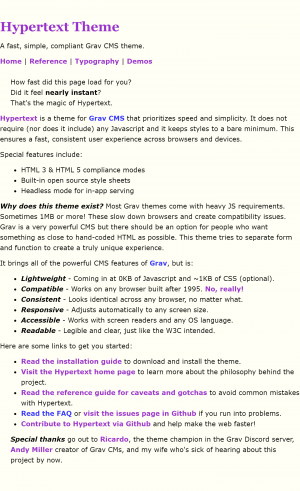 |
#16 w3c-oldstyle |
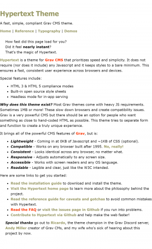 |
#17 w3c-steely |
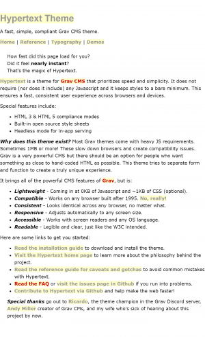 |
#18 w3c-swiss |
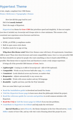 |
#19 w3c-traditional |
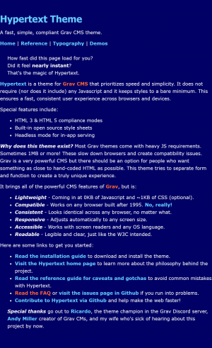 |
#20 w3c-ultramarine |
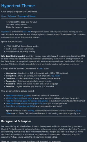 |
#21 water-dark |
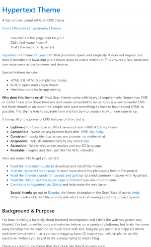 |
#22 water-light |
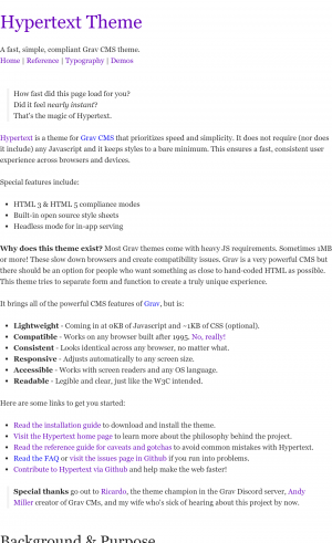 |
#23 writ |
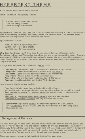 |
#24 yorha |